v23.06-1 Release Notes
Public Beta: Table Validation Module & Highlighting, New standard Viewer & deprecation old viewer, many small big things
🖥️ Public Beta: Table Validation Module & Better Highlighting
Our new Table Validation Module for repeatable fieldsets such as tables, line items and more is ready to go into Public Beta.
This finally allows for easy edit of any tabular data directly inside of Extraction Validation for your documents. Combined with the improved Highlighting this makes working with tables in documents a breeze.
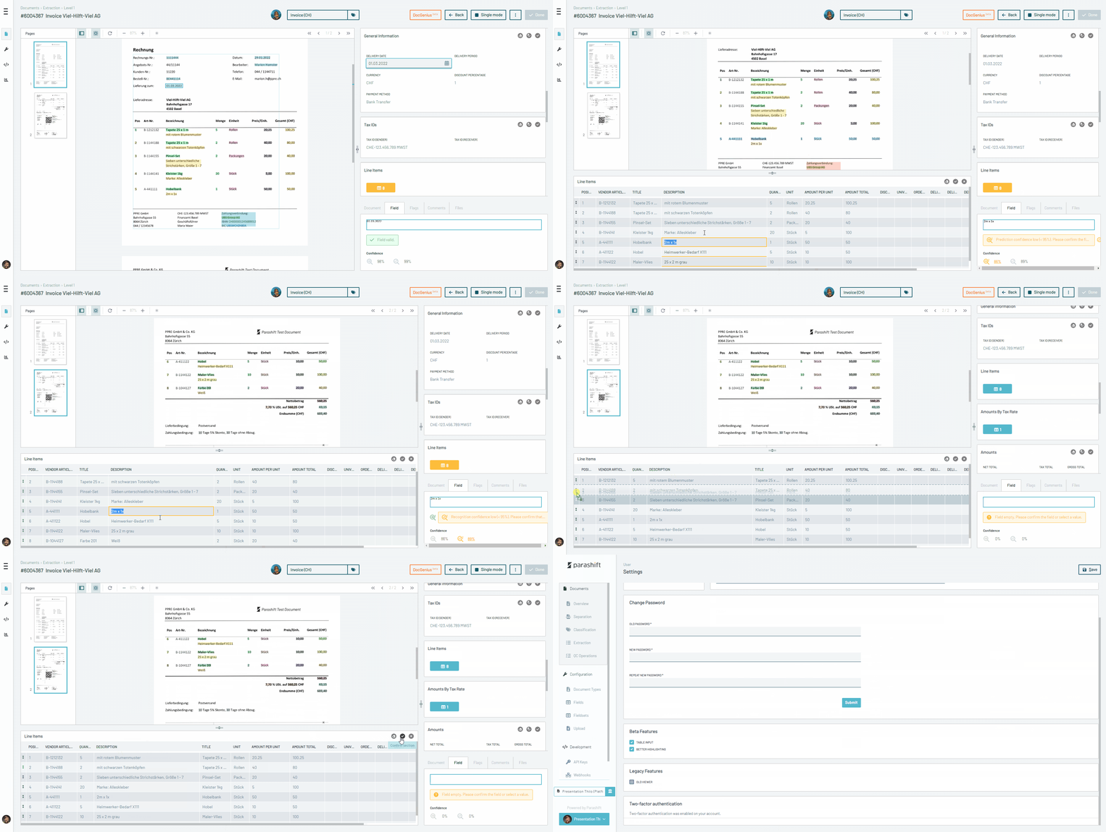
Some core features:
- Quickly resize the proportion of viewer/fields to get more/less space for your table
- Delete/Confirm/Add rows & columns from an easy-to-use context (right click) menu
- Drag & Drop Columns and Rows to re-order data
- Jump from Warning to warning to focus on the data that needs your attention
The new Highlighting will add row & column highlighting to easily spot Extraction problems as well as indicators of which rows of the table need your attention.
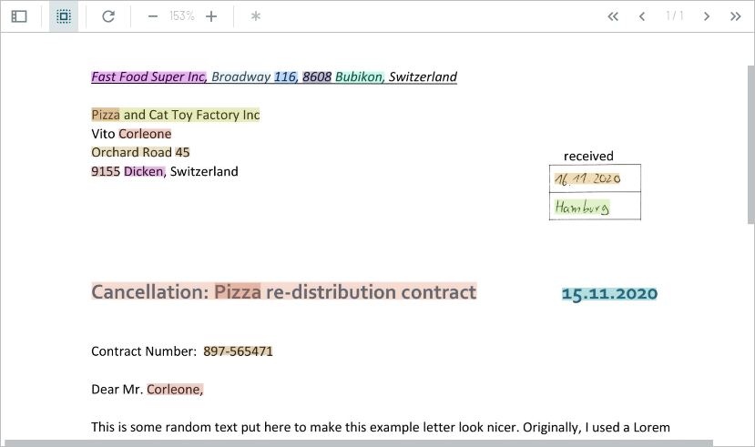
Currently, we just Highlight every field in a different colour, which is super convenient for data scientists but has a Christmas-tree vibe 🎄for normal users. We will add more end-user friendly Highlighting shortly (but keep the colourful variant as an option).
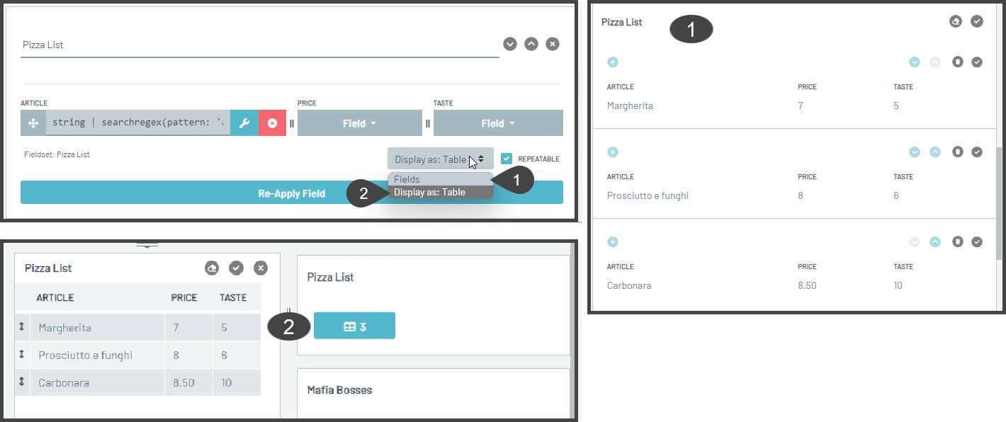
On the configuration side of things you can choose to use the new table module or the old repeatable fields layout, depending on the data you want to display/edit both can have their advantages 😃.
With Highlighting you will get options to Highlight only the fields, whole rows (adds grouping to field sections) or even columns (displays each field in its unique colour).
We plan to fully release these features by the end of the month. If you want to try them out (you should 😉), head over to your personal user settings and activate "Beta Features/Table Input", and "Beta Features/Better Highlighting".
👀 It's official: New Viewer
With this release, the new Viewer (announced in January) will now be the defacto standard Viewer in the Platform and the default for new users.
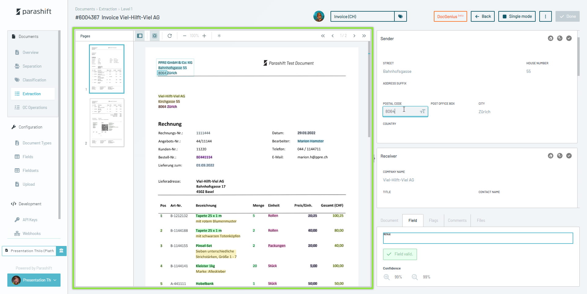
It comes with a new (collapsable) page preview, easier zoom-in/out capabilities, an easy way to navigate to the next page by simply scrolling and more. It is also the basis for all the new cool features like the Validation Table Module and Highlighting that we are adding.
So if you are not using the new Viewer yet, head over to your personal user settings and make sure to have the "Legacy Features/Old Viewer" DEACTIVATED.
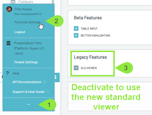
Should you find any breaking bugs with the new Viewer (which we hope not since we tested it very thoroughly internally as well as with client user groups) you can switch back to the old Viewer until
04.07.2023 -> After then we will remove the old Viewer.
🐁 Focus on one big thing and a lot of small big things
With the bulk of work done for the new Viewer, Table Module and Highlighting we want to take some time to focus on all the small user interface things that piled up the last couple of months that can have a big impact on the overall experience users have with the Platform.
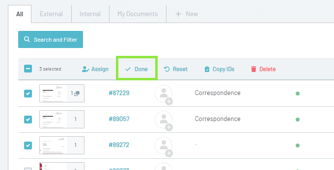
"Done" Bulk Action
We added a new "Done" bulk action to quickly clear document QC lists. But it can also be used documents in Separation, Classification or Extraction Validation, if documents are ready to be done
Improved scroll bars
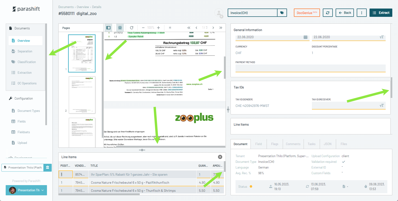
We synchronized the styling of all the different scroll bars around, giving the product a more uniform look and allowing us to optimize the overall user interface further in upcoming releases.
In the works: the comeback of "The Line"
In the new Viewer, we removed the connection line from the field to the value on the document. This caused some outrage in our user base as this feature is beloved by many.
Sorry for the commotion 🙇♂️, we hear you and will bring back the line in an updated format before the deprecation of the old viewer.

In the works: More space for content
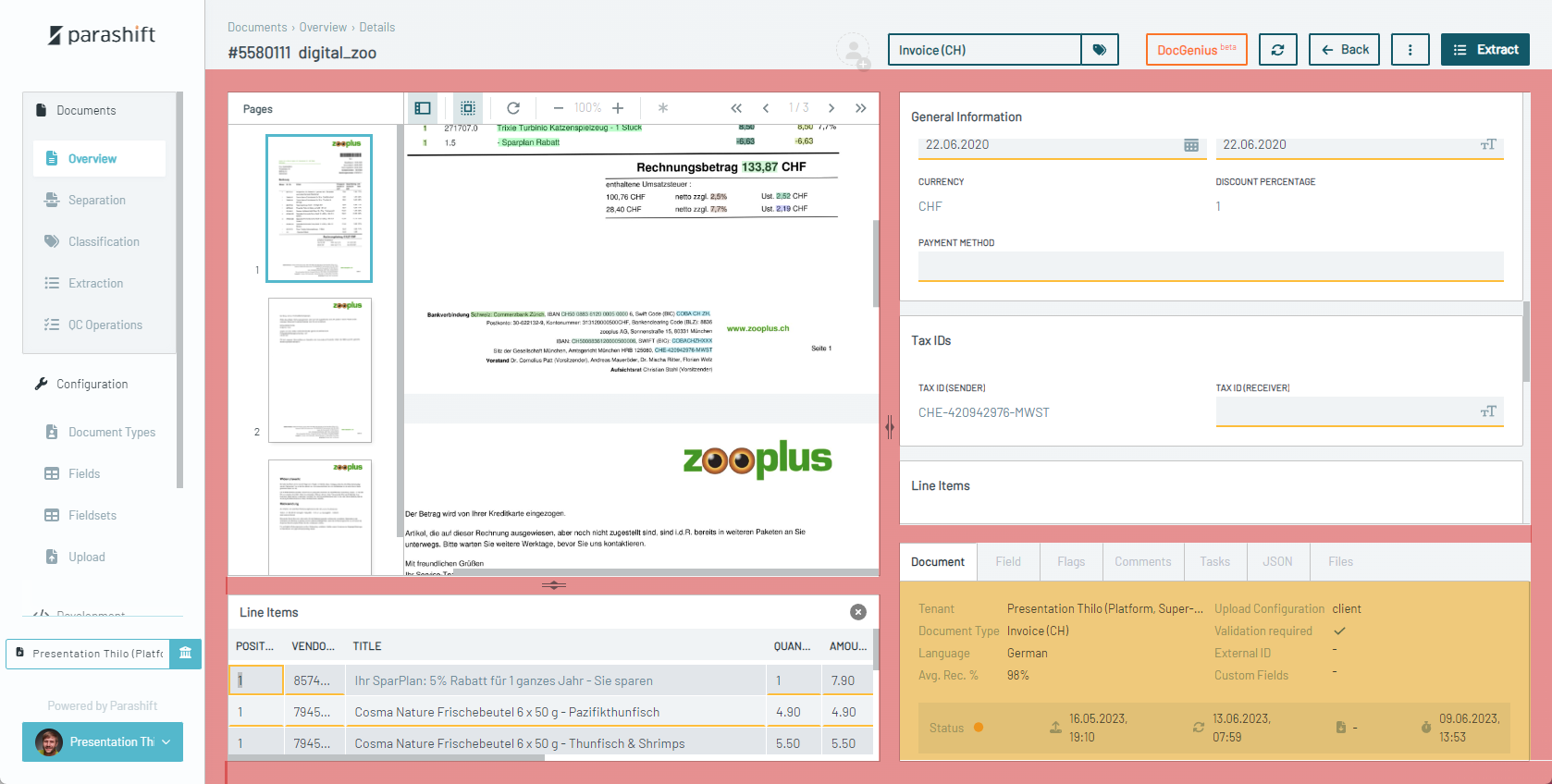
We have a lot of empty space in our user interface, which can be a good thing to not have the user interface seem cluttered. But we think we can do a better job utilizing all this lost space while keeping the overall clean and user friendly look.
In the works: More
Some more things to come, it's clean up time
- Allow resizing of tenant wide custom logo
- switch "Serial/Single" mode button to toggle
- More document list in line editing options like document name
- Easier manual upload of documents by e.g. drag & dropping them into any document list
- clean up & restructure field & fieldset configuration
- field candidates drop down re-work
- ...
💞 Other Improvements
- backend framework update on the newest version is nearly done leading to an overall more stable and performant system
- new beta machine learning table and line item extractors greatly reduce runtime and will improve extraction performance (already on par with old extractor, to be optimized further)
- improved infrastructure and services compliance & security
🐛 Fixed
- Extraction Validation, candidate drop-down hidden by other fields
- Viewer, "weird" scrolling behaviour
- Validation, Serial mode locking too many documents
- Workflow, Inbound file conversion issue failing documents
- Separation, Jump to Highlight not working on hover